Since they were first created in 1997, website pop-ups have garnered strong mixed emotions from their users. Some users find them annoying and disruptive, while others find them effective tools in separating web content from ads.
However, pop-ups can be used effectively to garner more readers and audiences when used properly. This article will outline some of the ways you can utilize them to your benefit.
What are Pop-ups?
A website pop-up is a graphical user interface (GUI) window that appears on top of a window that a user is viewing on a computer screen. Pop-ups are created as an online advertisement designed to generate leads and give second chances to users about to leave your site.
There are three main types of pop-ups based on how they will appear on the screen.
New Page Pop-up
This type of pop-up will appear in a new tab or window. While many websites have used these pop-ups, they are not as popular now since most browsers already have automatic pop-up blockers. In addition, new page pop-ups are no longer used since those that were not blocked usually get covered behind the main window, which the user will get to see only after closing it.
Full Page Pop-up
Full page pop-ups appear as a whole page that covers the main window. This type of pop-up prevents users from reading the main content unless they engage with the actions suggested by the pop-up.
In-Browser Pop-up
This type of pop-up is small in size and will fill only a small portion of the main window. In-browser pop-ups may appear as floaters on the sides of the main window and do not prevent users from reading contents or navigating the main window.
Whether you find web pop-ups disruptive or not, they are effective tools in making your site’s visitors take action by visiting your landing page, entering their email addresses, or taking advantage of your promotions. Here are some of the reasons why pop-ups work.
Welcome Distractions
Humans naturally want their attention diverted even for just a little bit, especially if they have been focused on a particular content for a while. Thus, pop-ups may be a refreshing distraction if timed properly.
Attention Grabbers
Pop-ups can grab your visitors’ attention and place them where you want them. By using pop-ups, you are separating your website’s contents from your call-to-action buttons.
Provide Added Value
You can use pop-ups to offer additional value to your users. With the proper timing, you can have pop-ups appear to get contact information from users interested in your content so they can have access to similar content in the future. Pop-ups will allow you to generate leads while giving your visitors additional content that they find valuable.
When Pop-ups Fail and How You Can Solve Them
Each of the three types of pop-ups has its advantages and disadvantages. However, when marketers abuse pop-ups, website visitors may choose to abandon your site completely to avoid engaging with pop-ups.
Surveys have shown that about 73% of users automatically disable pop-ups and around 45% of AdBlock users choose to remove as many ads as possible from their browsing experience. Here are some of the reasons why users hate seeing pop-up ads—and how to get around them to your advantage.
Guilt-Tripping Call-to-Action Buttons
Everybody wants to be treated with respect. However, many online marketers use their pop-ups to entice users to engage with their CTA buttons using guilt and condescending messages.
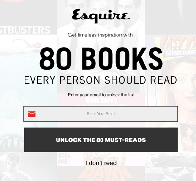
The pop-up shown above was designed to get a user’s email address for lead generation. However, instead of giving the user a choice between ‘Yes’ and ‘No’, the pop-up gives a condescending message that the user does not read books if they decline the offer.
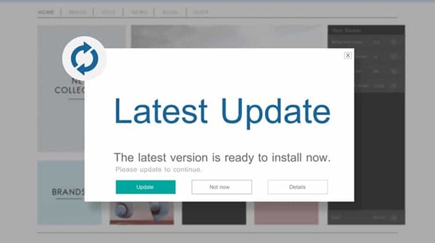
Your visitors may have several reasons for not engaging with your CTA button without assuming that they do not read. A better option would be to give your users a way out that is neither rude nor condescending. For example, the pop-up below gives the user a ‘Not Now’ option for not wanting to update at the moment.

Too Many Inputs Required to Reach Content
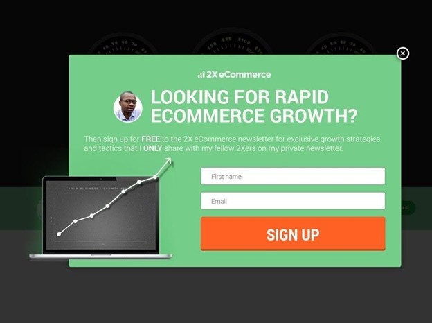
Online marketers need to get as much information from website visitors for lead generation. However, pop-ups with too many input fields may turn off users who may opt to abandon your site completely rather than give out too much information.
One way to solve this is to limit your pop-ups to getting two input fields at a time. For example, you can ask for the users’ names and email addresses before allowing them to go back to browsing your site’s main window. Then, if you need more information from your visitors, you can create multiple pop-ups that will get the necessary information as they progress through your content.

Poorly-Timed Pop-ups
When and where your pop-ups appear are critical in their effectiveness. Pop-ups such as welcome mats may work in getting leads and conversions. However, they are often seen as intrusive by most users who want to get to the contents. Likewise, product recommendation pop-ups that appear before a visitor has time to look at your main products may produce higher bounce rates.
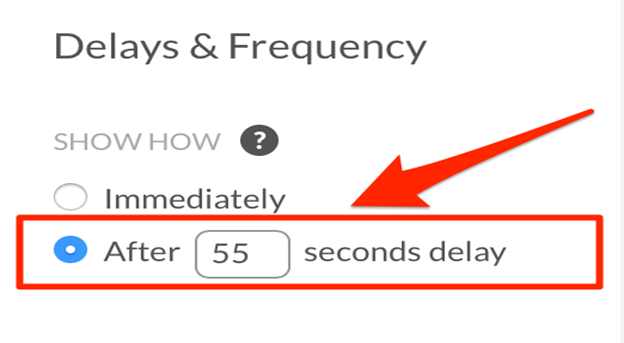
It is best to time your pop-ups properly. You can research the best time to show your pop-ups after 30 to 60 seconds of delay, which is enough time for visitors to have seen a significant percentage of your content. Likewise, you can trigger your pop-ups to appear after your visitors have scrolled through at least 35% or more of your contents page.
How to Make Pop-ups Relevant in 2021?
People are changing the way they transact businesses, and the current consumer persona is leaning towards e-commerce. It is therefore important for online marketers to use any strategy to their advantage. Website pop-ups have worked in the past and will most likely still give positive results when used in 2021.
A non-annoying pop-up will result in 20 to 70% of people giving you their contact information. It is, therefore, the responsibility of online marketers and website developers to ensure that pop-ups are less disruptive and will show results. Here are ways to use pop-ups effectively.
Make Them Stand Out
If you plan to use pop-ups, remember that they will always interrupt a user from reading your content or navigating your website. Likewise, your pop-ups may end up annoying your users. Therefore, it is important to make your pop-ups less irritating by making them visually appealing with graphics that will capture users’ attention and interests.
Limit Their Usage
If you must use pop-ups, do so sparingly and limit it to one pop-up appearance per unique visitor. Websites with multiple pop-ups may be effective in lead generation on rare occasions, but most often than not, they will annoy users to the point that they will never visit your site again.
Let Users Leave or Ignore Them
One of the most annoying parts of a pop-up is if it does not have an exit button. People hate being tricked and trapped into doing something they do not want to do. When you use a pop-up, it is best to ensure that users find it easy to leave the pop-up. Make sure to have an “X” button in the top right corner or allow users to leave by clicking outside the pop-up box. Likewise, let users have a “No Thanks” or “Not Right Now” option instead of giving them condescending choices for denying your offer.
Avoid Using Pop-ups for Mobile Users
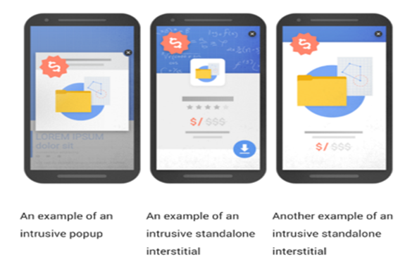
While it is tempting to target mobile users with pop-ups, it’s better not to. Whatever type they are, pop-ups are not suitable for mobile users since they cover the entire web content.
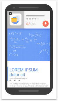
In 2017, Google implemented ranking penalties for websites that feature intrusive pop-ups on mobile users like those shown above. If you must use pop-ups for mobile, it is best to optimize your website to show pop-ups “above-the-fold” portion of the page where users can easily scroll down to get past your ads and reach your content.
Ensure Fast Loading Time
It is best to use compressed images and make your pop-ups simple. Simple pop-ups will load faster and will be out of the user’s mind in no time. However, while keeping your designs simple, it is best to research the wordings to use so your users can read your message within two to five seconds while getting what you want to achieve.
People hate having their favorite TV programs interrupted by commercials. However, if the commercials stand out, are witty, and short, then people might actually be engaged and interested instead.
The same goes for using pop-ups. You know that they will annoy your users, but if they are created with your users in mind, then they effectively get leads and converting your leads into customers.
Pop-ups remain a relevant tool in generating and converting leads. However, when you implement a marketing campaign using pop-ups, make sure that your website is optimized to show pop-ups without compromising its performance. Likewise, it’s better to place pop-ups where your users will notice them without fully covering your content.
Lastly, your pop-up design must conform with your overall website design and your brand.
