Since websites are often the first point of contact for consumers, they serve as virtual storefronts, conveying a brand’s identity and values. As a result, good website design has become increasingly important to consumers, influencing their perception of a business, and ultimately impacting their purchasing decisions. Staying ahead of the game entails catering to evolving consumer preferences, making it crucial for companies to regularly conduct site check-ups and optimize their websites to adopt top design trends.
First and foremost, good website design enhances the user experience. Consumers have become more discerning, expecting seamless navigation, intuitive interfaces, and visually appealing layouts. A poorly designed website with slow loading times, cluttered content, and confusing navigation will deter potential customers, leading them to abandon the site and seek alternatives. Investing in a well-designed website leads to a positive user experience that fosters engagement, boosts conversion rates, and ultimately builds customer loyalty.
Furthermore, a visually appealing website design builds trust and credibility. Consumers associate professional and visually appealing setups with reputable and trustworthy businesses. A website that lacks aesthetic appeal may convey a sense of neglect or amateurism, raising doubts in the minds of consumers. On the other hand, a visually unique and fresh approach to website design conveys professionalism, competence, and attention to detail, establishing credibility and encouraging consumer confidence.
Website design trends evolve rapidly, influenced by technological advancements, changes in user behavior, and shifts in aesthetic preferences. By staying current with these trends and implementing them into websites, businesses can ensure they provide consumers with a contemporary and impactful online experience.
20 notable website design trends and their effects on consumers
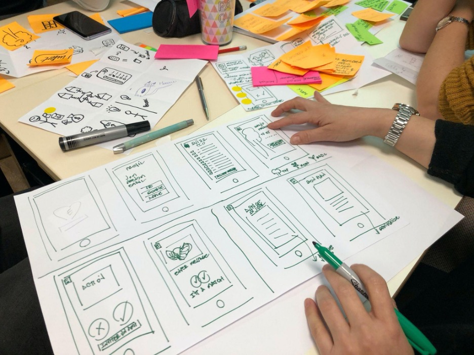
The constantly evolving field of website design has introduced numerous trends that impact consumers’ online experiences. These 20 notable website design trends have captured the attention of both designers and users alike. From scrolling effects and dynamic cursors to chatbots and virtual reality, these trends aim to enhance user engagement, improve functionality, and create visually appealing and immersive experiences.
By adopting these trends, businesses can provide a modern and impactful online presence that captivates their target audience and positively influences their perception and interaction with the brand.
Scrolling Effects
Scrolling effects involve manipulating website elements as users scroll through the content. Parallax scrolling, for example, creates a sense of depth by moving background and foreground elements at different speeds. This interactive technique adds visual interest and engages users, thereby encouraging continued website scrolling.
Dynamic Cursors
Dynamic cursors transform the traditional cursor into an interactive element that responds to user actions. They can change shape and color or incorporate animated effects. Dynamic cursors add a playful and engaging element to websites, compelling users to interact with content, specifically on-click-related actions.
Chatbots
Chatbots have been around for a couple of years but are gaining more popularity as a means of improving customer support and engagement. These AI-powered virtual assistants provide real-time responses to user queries, guiding visitors through the website and addressing their needs. Chatbots can undoubtedly enhance user experience; it streamlines communication, can even generate leads by capturing user information, and can help save customer support salary costs.
Voice-Activated Interface
With the rise of virtual assistants like Siri and Alexa, voice-activated interfaces have become increasingly relevant. More websites integrating voice commands in the following years will not come as a surprise. This trend improves accessibility and convenience by providing a hands-free browsing experience.
Visual Reality
Virtual Reality (VR) and Augmented Reality (AR) technologies are revolutionizing website design. By integrating VR or AR elements, businesses can create immersive experiences that overlay product images onto real-life environments. For example, furniture stores can showcase how their product will look in your home. This feature helps the user make relevant buying decisions.
Micro Interaction
Micro-interactions are subtle animations that add life and interactivity to a website. They can be used to highlight essential elements, such as links, and guide user attention or provide feedback on user interactions. Micro-interactions contribute to a polished user experience, making websites feel dynamic and responsive.
Organic Shapes
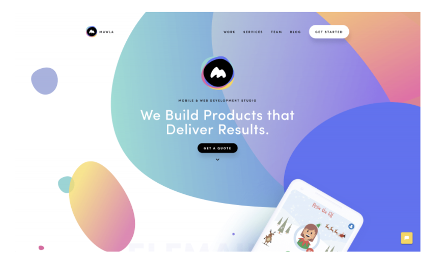
Unlike the traditional use of rigid and symmetrical shapes, organic shapes add a sense of fluidity and naturalness to website design. These asymmetrical and irregular shapes create visual interest that is more relatable because they are more in tune with human nature. Organic shapes give websites a unique and memorable aesthetic.
Geometric Shapes
By incorporating geometric shapes and patterns into website design, businesses can add character to an otherwise flat landscape. These elements can also be strategically placed to guide users’ attention towards specific call-to-action buttons, encouraging them to take desired actions.
Dark Mode
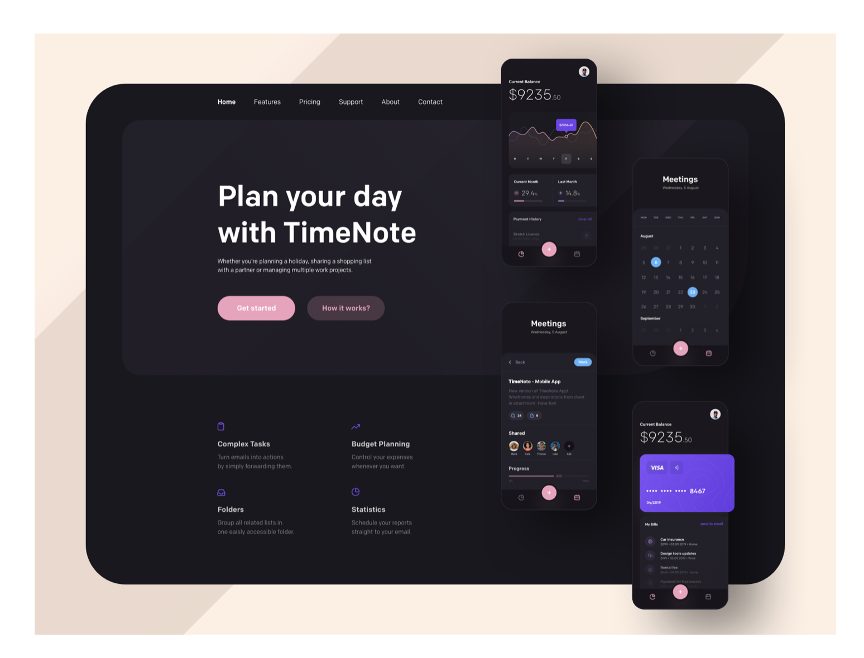
Dark mode has gained popularity due to its aesthetic appeal and potential benefits for reducing eye strain and energy efficiency. This design trend involves the use of dark backgrounds and light-colored text and elements to provide emphasis. Dark mode creates a striking and contrasting effect, ideal for websites focused on modern-style visual content.
Cinemagraphs
Cinemagraphs are a blend of static images and subtle motion. They are essentially still photographs with isolated moving elements. Cinemagraphs can come in the form of high-quality videos or looped GIFs. Cinemagraphs captivate attention and add visual interest to static pages. This trend can be used to create captivating hero images, banners, or background visuals. Adopting these website design trends can help businesses make a memorable first impression that allows their website to stand out from the competition.
Gradients
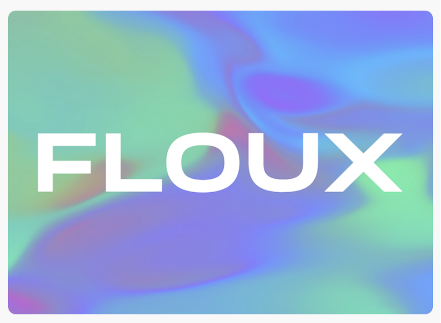
Gradients, the blending of two or more colors, are also prevalent in social media advertisements and websites. They have transitioned from monochromatic to multi-colored gradients this year. They add depth, visual interest, and a sense of energy to websites. They can be used as backgrounds for typography and overlays or to highlight specific elements, creating a vibrant and eye-catching impact.
Text-only
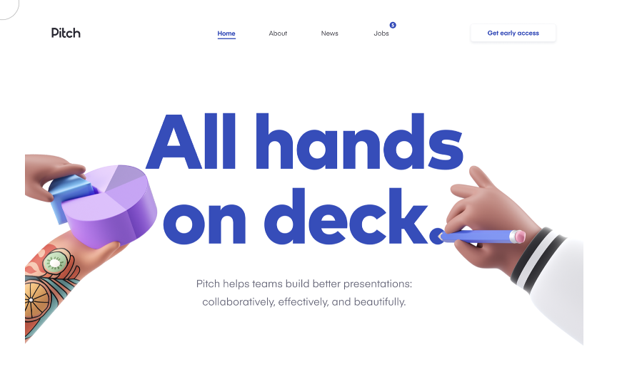
In a departure from traditional designs heavily reliant on images, text-only websites have gained popularity. These designs focus on typography as the primary visual element, leveraging creative fonts, sizes, and arrangements to convey messages. Text-only designs offer simplicity, grabbing users’ attention and ensuring they do not miss out on essential information. This minimalist design also allows for quick loading times.
Extreme Minimalism
The minimalist design trend champions simplicity, emphasizing clean lines, ample white space, and minimal embellishments. Some designers take minimalism to its maximum extent, displaying just the bare necessities. This approach allows content and key messages to take center stage, promoting a clear and uncluttered style. Minimalism enhances readability, facilitates quick navigation, and exudes a sense of modernity.
3D Design
With advancements in technology, 3D design software has become more accessible and widely used. Incorporating three-dimensional elements in website design adds depth, realism, and playfulness to the look and feel of a page. In addition, it can provide an entertaining experience that will keep users on the page longer.
Grids
Grid-based layouts offer a structured and organized approach to website design. By arranging content in a systematic grid pattern, businesses can achieve a balanced and harmonious visual composition. However, broken grids that go against the norm are starting to gain popularity. Grids are an efficient way to present text and images through logical information grouping.
Animated Illustration
Custom illustrations are widely used in website design because they can better express complex ideas, capturing attention and evoking emotion. Animation injects playfulness and interaction. Animated illustrations can guide users through a narrative, highlight key points, or add personality to a page.
Scrapbook Style
The scrapbook aesthetic, which sometimes mimics a mood board, brings a sense of nostalgia, creativity, and personalization to websites. It can be particularly effective for storytelling, artistic endeavors, or brands seeking a unique and memorable visual identity.
Pastel Hues
More designers have increasingly adopted pastel color palettes for their soothing and gentle appeal. Soft hues like blush pink, mint green, and baby blue create a sense of calmness, elegance, and femininity. Pastel colors can be used to set a particular mood or establish a cohesive and visually pleasing brand identity.
Minimal Vintage
The minimal vintage trend combines the simplicity of minimalism with nostalgic vintage elements. This style leverages vintage typography, a retro color palette, and imagery while maintaining a clean and uncluttered look. As a result, minimal vintage designs evoke a sense of timelessness.
Product Image Emphasis
Websites heavily focused on showcasing products, such as beauty and clothing brands, benefit from product image emphasis. Large, high-quality images, often in hero banners or full-screen displays, draw immediate attention and allow visitors to obtain a detailed view of the products. This trend enhances visual appeal, promotes product understanding, and can significantly impact purchasing decisions.
In Conclusion
Images create connections, build trust, and drive conversions. Colors evoke emotions and establish brand identity. Videos engage and inform users, increasing conversions. Typography sets the tone and enhances readability. Infographics and charts simplify complex information, aiding decision-making. Animation adds interactivity and visual interest. By investing in regular website check-ups, businesses can identify performance bottlenecks and areas for improvement, ensure responsive design, and fine-tune visual elements, which are essential to maintaining optimal digital performance and providing a seamless and efficient user experience.
Good website design is achieved when it can attract and retain consumers in the digital landscape, ultimately earning the trust and loyalty of the target audience and contributing to success in the highly competitive online marketplace.